Estores Alicante
Decoration

How to choose the color of your blinds: Practical decoration guide

📅 10 Jul 2026⏱️ 10 min read
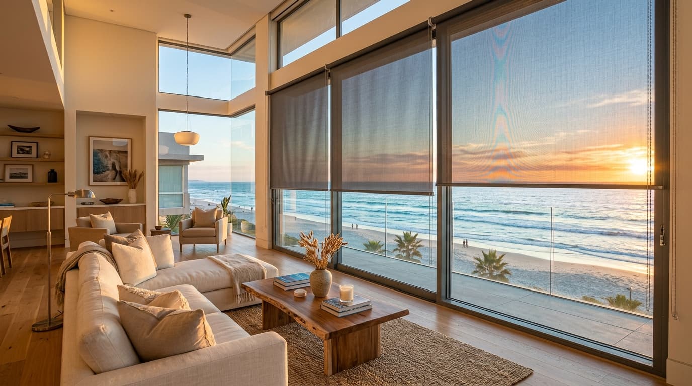
Roller blinds in different neutral tones installed in a modern home

When dressing the windows of our home, a fundamental decorative and functional question arises: how to choose the color of your blinds? This decision goes far beyond a simple aesthetic preference. The tone selected for your blinds will directly influence the quality and temperature of the light entering the room, the feeling of spaciousness, the combination with the walls, and the general atmosphere that will be breathed in each room.

The wrong color can visually shrink a living room, make a bedroom feel cold, or create annoying reflections on screens. On the contrary, getting the right shade will enhance the natural beauty of your furniture and create a balanced and cozy environment. In this complete guide, we will analyze in detail all the factors you should take into account to find the perfect color for your custom blinds.

1. The influence of natural light and room orientation

The amount and type of sunlight a room receives is the first technical factor we must evaluate. Natural light is not homogeneous; its color temperature changes throughout the day and depending on the geographical orientation of the window. This completely alters how we perceive the colors of the fabrics:

  • North Orientation: These rooms receive colder, bluer light all day. To counteract this coldness and make the room warmer and cozier, ideally, choose blinds in warm tones like beige, cream, sand, or off-whites with yellow or peach nuances. Avoid pure grays or bluish tones, as they will dull the room.
  • South Orientation: They receive very intense and warm light, especially during the central hours of the day. In this case, you can opt for cool neutral colors like pearl gray, pure whites, or even darker tones (brown, charcoal gray) to filter the excess brightness and visually cool the space.
  • East Orientation: They enjoy direct light in the morning and shade in the afternoon. Medium intensity neutral colors work wonderfully here, adapting well to both morning sun and indirect afternoon light.
  • West Orientation: Direct light hits very intensely in the afternoon, with very warm and golden tones. Cool or muted neutral colors help balance this torrent of warm light in the final hours of the day.

In addition to orientation, we must consider the fabric's behavior towards light. For example, dark-colored screen fabrics absorb more light but offer excellent exterior visibility without glare, while light colors reflect more light inwards, providing extra brightness to rooms lacking large windows.

2. Room size and space perception

Colors have the ability to visually modify the dimensions and proportions of a room. When choosing the tone of your blinds, you must consider whether you want to optically enlarge the space or if you prefer to provide greater intimacy and warmth:

Small rooms or low ceilings

In small spaces, the golden rule is visual continuity and brightness. Light colors are your best allies:

  • White and ecru blinds: They reflect most of the light and make the window boundaries seem to blur, creating an immediate feeling of spaciousness.
  • Tone on tone with the wall: Choosing a blind of a color almost identical to the adjacent wall avoids abrupt visual interruptions, making the whole room appear much more spacious and clear.

Large rooms or very high ceilings

If you have a large living room or a very spacious bedroom, you have greater creative freedom and can use the blinds to "dress" and structure the space:

  • Dark or contrasting color blinds: Tones like anthracite gray, black, chocolate brown, or navy blue act as powerful focal points. They help frame the views, bring sophistication, and reduce the feeling of emptiness that overly large rooms sometimes generate.
  • Warm and intense colors: They help bring the walls visually closer, creating a much more intimate, comfortable, and cozy atmosphere.

3. Harmony with wall color and decoration

To achieve balanced interior design, the blinds must logically integrate with the dominant colors of the room, primarily that of the walls and main furniture (sofas, headboards, or large tables). There are three main combination strategies:

Strategy How it is applied Visual Effect Ideal for...
Monochromatic (Same tone) Blind of a very similar or identical tone to the wall. Continuity and spaciousness Minimalist environments, small rooms, and serene decorations.
Harmonic Neutrals Combining different neutrals (e.g., beige wall with pearl gray blind or vice versa). Sophistication and warmth Contemporary living rooms, kitchens, and elegant master bedrooms.
Active Contrast Blind of an opposite or much darker/striking color than the wall. Dynamism and focal point Large windows, home offices, and modern design rooms.

Quick combination guide according to your wall

  • White walls: The most versatile canvas. If you want to maintain visual peace, choose white or off-white blinds. If you are looking for a touch of contemporary elegance, pearl gray, natural linen, or anthracite gray blinds will create a beautiful, clean contrast.
  • Beige, sand, or earth walls: Combine them with ecru or toasted tone blinds to enhance the cozy, natural style. Textured finishes that imitate linen or wood complement this palette perfectly.
  • Gray walls: Look for contrast in intensity. If the wall is light gray, a dark gray blind will add volume. If the wall is dark, a white or pearl gray blind will balance the space by filling it with light.
  • Walls with bright colors (blue, green, pink): In this case, it is highly recommended to opt for neutral blinds in white, cream, or light gray tones so as not to visually overload the space and let the wall remain the main protagonist.

4. Current trends in blind colors

Interior design is constantly evolving, and blind colors are no exception. Current trends move away from artificial or excessively loud colors and focus on the search for connection with nature and serene elegance:

  • Earth tones (Linen, Sand, Stone): They are the undisputed favorites of warm minimalism and Japandi style. They provide wonderful warmth without detracting from brightness. In addition, they hide everyday dust and particles very well, making them ideal for everyday use.
  • Pearl gray and anthracite gray: They hold strong as the quintessential tones for modern, industrial, and avant-garde homes. The contrast generated by an anthracite gray or black blind against white carpentry or light walls is spectacular.
  • Off-white and ivory: They remain the kings of sales. The reason is simple: they combine with absolutely everything, never go out of style, and uniquely maximize the natural light entering through the window.
  • Soft organic tones (Olive green, powder blue, terracotta): Used sparingly in playrooms, children's bedrooms, or modern rustic kitchens to add a subtle, fresh touch of color integrated with nature.

5. Practical tips for choosing color by room

Each room in the house has a different use, and the choice of blind color should respond to the activities performed in each of them:

The Living Room: the social space

We spend many hours in the living room relaxing, watching TV, or chatting with guests. Neutral and bright tones are the best options to favor comfort. If you want to dive deeper into the style of your common area, we recommend consulting our complete guide to choosing the perfect blind for your living room, where we detail specific technical fabrics for this area.

Bedrooms: the sanctuary of rest

Here we seek to fall asleep and encourage relaxation. Soft, muted tones (grays, beiges, sands) induce calm. If you don't have exterior shutters, combining a light translucent blind for the day with a dark blackout blind for the night will give you absolute control of your rest.

The Kitchen: functionality and cleanliness

The kitchen is prone to splashes, smoke, and grease. Intermediate colors (like light gray or soft sand tones) are perfect because they hide small stains much better than pure white. Always choose screen or resin-coated fabrics that are easy to clean with a damp cloth.

Summary: Your ideal decision with Estores Alicante

In short, to successfully choose the color of your blinds, you must balance the natural light of the room, the size of the room, the tone of your walls, and the use you will make of that space. Taking the necessary time to analyze these points will guarantee an optimal and lasting decorative result.

Still have doubts about the exact shade that will look best in your home? Don't worry. At Estores Alicante we understand that seeing colors on a computer or mobile screen can be misleading due to brightness calibration. Therefore, we offer our free home measurement service throughout the province of Alicante, where we bring physical catalogs with real samples so you can see and touch the fabrics under the lighting of your own rooms.

To learn more details about our professional trajectory and how we work in the province, we invite you to visit the about us section and discover why we are the favorite choice of hundreds of Alicante homes.

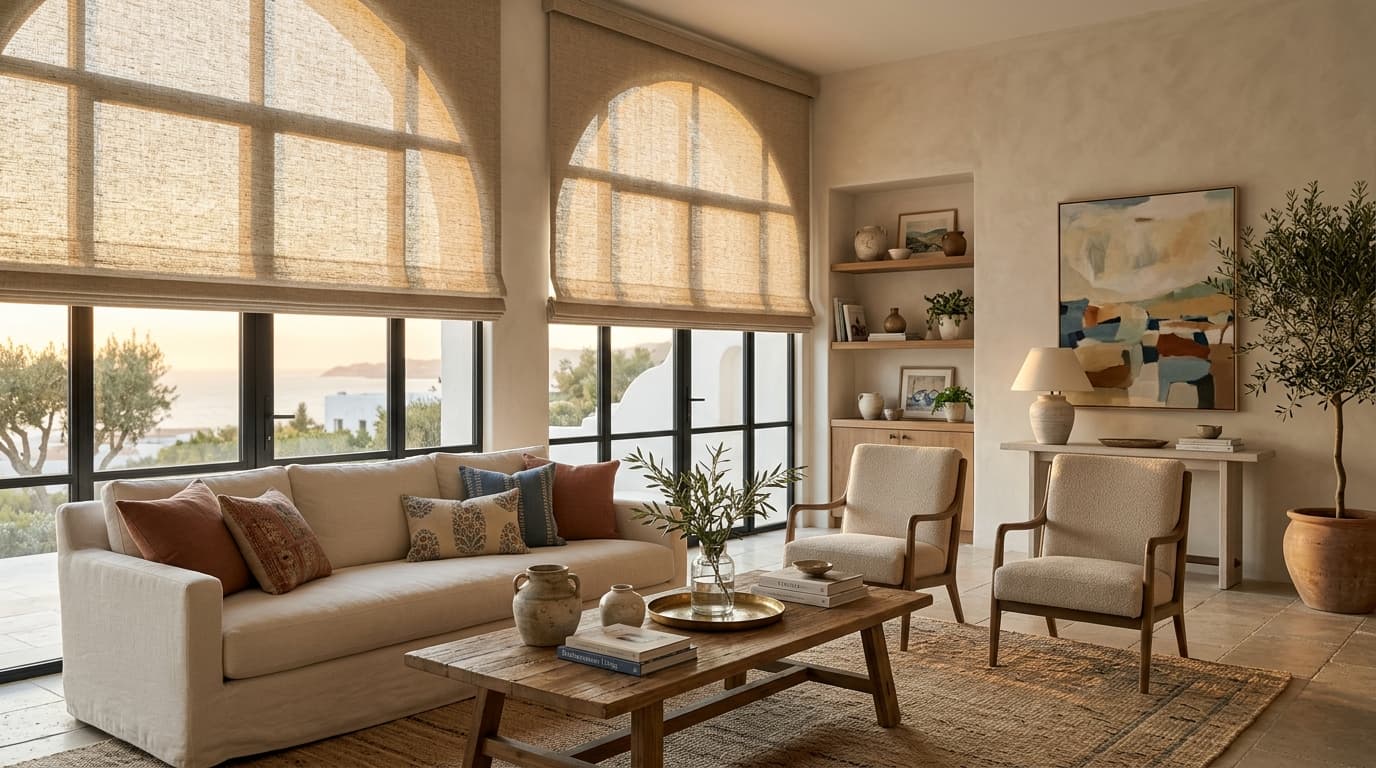
Estores en salón con vistas al mar
🏠

Want the perfect blind for your living room?

Request a free home visit in the Alicante province. We measure with no obligation and show you physical fabric samples on your own window.

Related articles